Lesson 5 Overview
LESSON 5: INTERPOLATION - FROM SIMPLE TO ADVANCED
Lesson 5 Overview
Introduction
In this lesson we will examine one of the most important methods in
all of spatial analysis. Frequently data are only available at a sample
of locations when the underlying phenomenon is, in fact, continuous
and, at least in principle, measurable at all locations. The problem,
then, is to develop reliable methods for 'filling in the blanks.' The
most familiar examples of this problem are meterological, where weather
station data are available, but we want to map the likely rainfall,
snowfall, air temperature, and atmostpheric pressure conditions across
the whole study region. Many other phenomena in physical geography are
similar, such as soil pH values, concentrations of various pollutants,
and so on.
The general name for any method designed to 'fill in the blanks' in
this way is interpolation. It may be worth noting that
the word has the same origins as extrapolation, where we use
some observed data to extrapolate beyond known data. In interpolation,
we extrapolate between measurements made at a sample of
locations.
Learning Objectives
By the end of this lesson, you should be able to
- explain the concept of a spatial average and describe different ways
of deciding on inclusion in a spatial average
- describe how spatial averages are refined by inverse distance
weighting methods
- explain why the above interpolation methods are somewhat arbitrary
and must be treated with caution
- show how regression can be developed on spatial co-ordinates to
produce the geographical technique known as trend surface analysis
- explain how a variogram cloud plot is constructed and, informally
show how it sheds light on spatial dependence in a dataset
- outline how a model for the semi-variogram is used in kriging and
list variations on the approach
- make a rational choice when interpolating field data between inverse
distance weighting, trend surface analysis, and geostatistical
interpolation by kriging
- explain the conceptual difference between interpolation and density
estimation
Reading Assignment
The reading this week is again quite detailed and demanding, and
again, I would recommend starting early. You need to read the
following:
- Section 8.3, "Spatial Interpolation," pages 220-234
- Chapter 9, "Knowing the Unknowable: The Statistics of Fields" (more
advanced methods of interpolation, in particular trend surface analysis
and kriging), pages 246-83
- Section 2.4, "Preview: The Variogram Cloud and the Semivariogram,"
pages 45-49
 It is OK if you're reading of Chapter 9 is a little less thorough than
for other parts of this course, as the primary aim here is that you
develop a knowledge of the methods covered in that chapter at an
overview level, rather than at the level of all the grisly mathematical
detail.
It is OK if you're reading of Chapter 9 is a little less thorough than
for other parts of this course, as the primary aim here is that you
develop a knowledge of the methods covered in that chapter at an
overview level, rather than at the level of all the grisly mathematical
detail.
After you've completed the reading, or at the very least skimmed the
material, get back online and supplement your reading from the
commentary material, then test your knowledge with the self-test
quizzes.
Lesson 5 Deliverables
This lesson is one week in length. The following items must be
completed by the end of the week. See the Calendar tab, above,
for the specific date.
- Complete the two self-test quizzes satisfactorily (you have an
unlimited number of attempts and must score 90% or more).
- Complete Project 5, which involves working with
interpolation methods in a GIS setting. (The materials for Project 5
can be found under the Lessons tab, in the Lesson 5
folder.)
- Continue the Quarter-long Project by providing
commentary on two of your colleagues' project proposals as described in
the
Week 5 directions. (This link opens in a new window. The materials
for the Quarter-long Project can be also be found under the Lessons
tab.)
Questions?
If you have any questions now or at any point during this lesson,
please feel free to post them to the Lesson 5 thread on the
Lesson Content Discussion Forum. (That Discussion Forum can be
accessed at any time by clicking on the Communicate tab,
above, and then scrolling down to the Discussion Forums
section.)
Ready to continue? Click on the "Next" link, above, to continue with
this lesson.
LESSON 5: INTERPOLATION - FROM SIMPLE TO ADVANCED
Commentary - Chapter 8, Section 8.3, "Spatial Interpolation"
The Basic Concept
A key idea in statistics is estimation. A better word for it
(but don't tell any statisticians I said this...) might be
guesstimation, and a basic premise of much estimation theory is
that the best guess for the value of an unknown case, based on
available data about similar cases is the
mean value of the measurement for those similar cases.
This is not a completely asbtract idea: in fact, it is an idea we
apply regularly in everyday life.
I'm reminded of Christmas time, when quite a few packages might be
arriving at the house. When I take a box from the mail carrier, I am
prepared for the weight of the package based on the size of the box. If
the package is much heavier than is typical for a box of that size, I
am surprised, and have to adjust my stance to cope with the weight. If
the package is a lot lighter than I expected then I am in danger of
throwing it across the room! More often than not, my best guess based
on the dimensions of the package works out to be a pretty good guess.
So, the mean value is often a good estimate or 'predictor' of an
unknown quantity.
Introducing Space
However, in spatial analysis, we ususally hope to do better than
that, because of a couple of things:
- Near things tend to be more alike than distant things (this is
spatial autocorrelation at work), and
- We have information on the spatial location of our observations.
Combining these two observations is the basis for all the
interpolation methods described in section 8.3. Instead of using simple
means as our predictor for the value of some phenomenon at an unsampled
location, we use a variety of locally determined spatial means, as
outlined in the text.
In fact, not all of the methods described are used all that often. By
far the most commonly used in contemporary GIS is an inverse-distance
weighted spatial mean (pages 223-32).
Limitations
It is important to understand that all of the methods described in
section 8.3 share one fundamental limitation, mentioned on page 229,
but not emphasized. This is that they cannot predict a value beyond the
range of the
sample data. This means that the most extreme values in any map
produced from sample data, will be values already in the sample data,
and not values at unmeasured locations. It is easy to see this by
looking at the example below, which has been calculate using a simple
average of the nearest 5 observations to interpolate values.
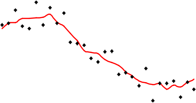
Red line is the interpolated value (i.e., vertical
position) based on a simple average of the nearest 5 sample values.
It is apparent that the red line representing the interpolated values
is less extreme than any of the sample values represented by the point
symbols. This is a strong assumption made by simple interpolation
methods that kriging attempts to address (see later in this
lesson).
Distinction Between Interpolation and Kernel Density Estimation
Pay close attention to the box on page 234 ("Interpolation and
Density Estimation"). It is easy to get interpolation and
density estimation confused, and in some cases the mathematics used
is very similar, adding to the confusion. The important distinction is
the intention behind employing each method.

Ready? Take the Section 8.3 Quiz to check your knowledge! Click on
the "Next" link, above, to access the self-test quiz on Section 8.3.
You have an unlimited number of attempts and must score 90% or more.
Ready to continue? Click on the "Next" link, above, to begin the
Section 8.3 Interpolation Quiz.
LESSON 5: INTERPOLATION - FROM SIMPLE TO ADVANCED
Commentary - Chapter 9, Section 9.2, "Review of Regression"
Regression is the basis of another method of spatial
interpolation�
trend surface analysis�so before looking at that, we will
review regression. The discussion of
regression in section 9.2 may be a little technical for some tastes.
If you can handle it, so much the better�I find this visual treatment
of regression very helpful in understanding how regression works.
On the other hand, if you are wondering, "What the heck's
regression?," here is the two minute summary�which is more than
adequate for present purposes.
Simple linear regression is a method that models the variation in a
dependent variable (y) by estimating a best-fit
linear equation in an
independent variable (x). The idea is that we have
two sets of measurements on some collection of
entities. Say, for example, we have data on the
mean body and brain weights for a variety of animals. We would
expect that heavier animals will have heavier brains, and this is
confirmed by a scatter plot:
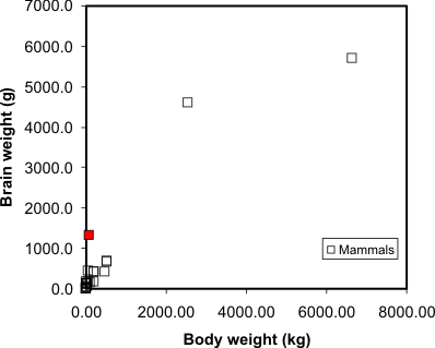
Scatter plot of animal brain weights relative to
their body weight. Humans are the red square (which is reassuring).
Source: P. J. Rousseeuw and A. M. Leroy (1987) Robust Regression and
Outlier Detection. Wiley, p. 57.
A regression model makes this visual relationship more precise, by
expressing it mathematically, and allows us to estimate the brain
weight of animals not included in the sample data set. Visually, the
regression equation is a trendline in the data (in fact, in
many spreadsheet programs, you can determine the regression equation by
adding a trendline to an X-Y plot, as I have done here):
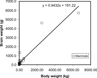
Regression line and equation added to the mammal
brain weight data. Source: P. J. Rousseeuw and A. M. Leroy (1987)
Robust Regression and Outlier Detection. Wiley, p. 57.
... and that's all there is to it! It is occasionally useful to know
more of the underlying mathematics of regression, but the important
thing is to appreciate that it allows the trend in a data set to be
described by a simple equation.
A postscript...
Completely irrelevant, but it is sort of fun: the same dataset
(below) contains similar data for three species of dinosaurs, and is
quite revealing:
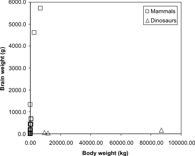
The same dataset, but with three dinosaurs included.
Source: P. J. Rousseeuw and A. M. Leroy (1987) Robust Regression and
Outlier Detection. Wiley, p. 57.
It is apparent that for all their enormous size, some dinosaurs at
least had quite tiny brains (comparable to those of present day
kangaroos or sheep, which are far from the smartest of animals).
But I digress...
Ready to continue? Click on the "Next" link, above, to continue with
this lesson.
LESSON 5: INTERPOLATION - FROM SIMPLE TO ADVANCED
Commentary - Chapter 9, Section 9.3, "Regression on Spatial
Coordinates: Trend Surface Analysis"
With even a basic appreciation of
regression, the idea behind
trend surface analysis is very clear. Treat the
observations (temperature, height, rainfall, population density,
whatever they might be) as the dependent variable, in a regression
model that uses spatial coordinates as its
independent variables.
This is a little more complex than simple regression, but only just.
Instead of finding an equation
z = b0 + b1
x,
where z are the observations of the
dependent variable, and x is the independent variable, we
find an equation
z = b0 + b1
x + b2y,
where z is the observational data, and x and y
are the geographic coordinates of locations where the observations are
made. This equation defines a plane, as shown in figure 9.4 (page 257).
In fact, trend surface analysis finds the underlying
first order trend in a spatial dataset (hence the name).
As an example of the method, the image below shows the settlement
dates for a number of towns in Pennsylvania as vertical lines such that
longer lines represent later settlement. The general trend of early
settlement in the southeast of the state around Philadelphia to later
settlement heading north and westwards is evident.
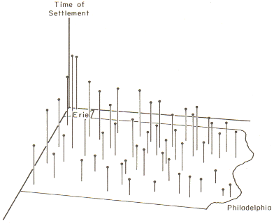
Settlement times of Pennsylvania towns shown as
vertical lines. Source: Abler, Ronald F., John S. Adams, and Peter
Gould. Spatial Organization the Geographer's View of the World.
Englewood Cliffs, NJ: Prentice-Hall, 1971, page 135.
In this case, latitude and longitude are the x and y
variables, and time of settlement is the z variable.
When trend surface analysis is conducted on this dataset, we obtain
an upward sloping
mean time of settlement surface that clearly reflects the evident
trend, and we can draw
isolines (contour lines) of settlement date:
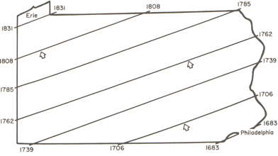
Isolines for the time of settlement trend surface.
Source: Abler, Ronald F., John S. Adams, and Peter Gould. Spatial
Organization the Geographer's View of the World. Englewood Cliffs, NJ:
Prentice-Hall, 1971, page 136.
While this confirms the evident trend in the data, it is also useful
to look at departures from the trend surface, which, in regression
analysis are termed residuals or errors.
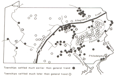
In this view, black filled settlements were settled
well before the general trend, and open circles indicate settlements
formed later than the general trend. Source: Abler, Ronald F., John S.
Adams, and Peter Gould. Spatial Organization the Geographer's View of
the World. Englewood Cliffs, NJ: Prentice-Hall, 1971, page 136.
The role of the physical geography of the state is evident in the
pattern of early and late settlement, where most of the early
settlement dates are along the Susqehanna River valley, and many of the
late settlements are beyond the ridge line of the Allegheny Front.
This is a relatively unusual application of trend surface analysis.
It is much more commonly used as a step in universal kriging,
when it is used to remove the
first-order trend from data, so that the kriging
procedure can be used to model the
second-order spatial structure of the data.
Ready to continue? Click on the "Next" link, above, to continue with
this lesson.
LESSON 5: INTERPOLATION - FROM SIMPLE TO ADVANCED
Commentary - Chapter 2, Section 2.4, "Preview: The Variogram Cloud
and the Semivariogram"
[Note that the jump here to Section 2.4 is intentional!]
We have seen how simple interpolation methods use locational
information in a dataset to improve estimated values at unmeasured
locations. We have also seen how a more 'statistical' approach can be
used to reveal
first order trends in spatial data. The former approaches makes some
very simple assumptions about the '
first law of geography' in order to improve estimation. The latter
approach uses only observed
patterns in the data to derive spatial patterns. The last approach
to spatial interpolation that we consider combines both methods by
using the data to develop a mathematical model for the spatial
relationships in the data, and then uses this model to determine the
appropriate weights for spatially weighted sums.
The mathematical model for the spatial relationships in a dataset is
the
semivariogram. The sequence of steps outlined in section
2.4 (pages 45-9) and then extended in section 9.4 (pages 266-74)
describes how a semivariogram function may be fitted to a set of
spatial data.
It is not important in this course to understand the mathematics
involved here in great detail. It is more important to understand the
aim, which is to obtain a concise mathematical description of some of
the spatial properties of the observed data, which may be used to
improve estimates of values at unmeasured locations.
You can get a better feel for how the variogram cloud and the
semivariogram work by experimenting with the Geostatistical Analyst
extension in ArcGIS, which you will do in this week's project.
Ready to continue? Click on the "Next" link, above, to continue with
this lesson.
LESSON 5: INTERPOLATION - FROM SIMPLE TO ADVANCED
Commentary - Chapter 9, Section 9.4, "Statistical Approach to
Interpolation: Kriging"
The Semivariogram, pages 266-74
This long and complex section builds on section 2.4 by first giving
a more complete account of the
semivariogram. Particularly noteworthy are:
- Figure 9.7 (page 270) repays careful study. It shows how the
semivariogram summarizes three aspects of the spatial structure of the
data:
- The local variability in observations, in a sense, the
uncertainty of measurements, regardless of spatial aspects is
represented by the
nugget value;
- The characteristic spatial scale of the data is represented by the
range. At
distances greater than the range observations are of little use in
estimating an unknown value;
- The underlying variance in the data is represented by the
sill value.
- The 'cautionary tale' (pages 273-4) is also important, and shows
what happens if there is a strong
first order trend to a dataset. The semivariogram shows this by not
'leveling off' to a sill value. Because of the trend, the further apart
are any two observations, the more different they will be. We cope with
this by modeling the trend using
trend surface analysis, subtracting the trend from the base
data to get residuals, and then fitting a semivariogram to the
residuals.
Kriging, pages 274-81
If you have a strong background in mathematics you may relish the
discussion of kriging, otherwise you will most likely be thinking,
"Huh?!" If that's the case, don't panic! It is possible to carry out
kriging without fully understanding the mathematical details, as we
will see in this week's project. If you are likely to use kriging a lot
in your work, I would recommend finding out more from one of the
references in the text (Isaaks and Srivastava's book is particularly
good, and amazingly readable given the complexities involved).
Ready? Take the Advanced Interplation Quiz (Chapter 9 plus Section
2.4) to check your knowledge! Click on the "Next" link, above, to
access the self-test quiz on Advanced Interplation. You have an
unlimited number of attempts and must score 90% or more.
Ready to continue? Click on the "Next" link, above, to begin the
Advanced Interplation Quiz.
LESSON 5: INTERPOLATION - FROM SIMPLE TO ADVANCED
Final Activities for Lesson 5
Now that you've completed the readings and self-test quizzes for this
lesson, it is time to apply what you've learned!
The following links will open in a new browser window.
- Complete Project 5, which involves working with
interpolation methods in a GIS setting. (When you are done reviewing
this Web page, click on the "Next" link, above, to begin Project 5. The
materials for Project 5 can also be found under the Lessons
tab, in the Lesson 5 folder.)
- Continue the Quarter-long Project by providing
commentary on two of your colleagues' project proposals as described in
the
Week 5 directions. (This link opens in a new window. The materials
for the Quarter-long Project can be also be found under the Lessons
tab.)
Ready to continue? Click on the "Next" link, above, to begin Project
5.
PROJECT 5: INTERPOLATION METHODS
Overview
Background
This week and next we'll work on data from Central Pennsylvania,
where Penn State's University Park campus is located. This week we'll
be working with elevation data showing the complex topography of the
region. Next week, we'll see how this ancient topography affects the
contemporary problem of determining the best location for a new high
school.
Introduction
The aim of this week's project is to give you some practical
experience with interpolation methods, so that you can develop a feel
for the characteristics of the surfaces produced by different methods.
To enhance the educational value of this project, we will be working
in a rather unrealistic way, because you will know at all times the
correct interpolated surface, namely the elevation values for part of
central Pennsylvania (the part that is home to Penn State, as it
happens). This means that it is possible to compare the interpolated
surfaces you create with the 'right' answer, and to start to understand
how some methods produce more useful results than others. In real-world
applications, you don't have the luxury of knowing the 'right answer'
in this way, but it is a useful way of getting to know the properties
of different interpolation methods.
In particular, we will be looking at how the ability to incorporate
information about the spatial structure of a set of control points into
kriging, using the semivariogram, can significantly improve the
accuracy of the estimates produced by interpolation.
To further enhance your learning experience, this week I would
particularly encourage you to contribute to the project Discussion
Forum. There are a lot of options in the settings you can use for any
given interpolation method, and there is much to be learned from asking
others what they have been doing, suggesting options for others to try,
and generally exchanging ideas about what's going on. I will contribute
to the discussion when it seems appropriate. Remember that a component
of the grade for this course is based on participation, so if you've
been quiet so far, this is an invitation to speak up!
Project Resources
The data files you need for Project 5 are available here in a zip
archive file. If you have any difficulty downloading this file, please
contact me.
That file is 3.3 Mb and will take approximately 8 minutes to download
over a 56 Kbps modem. Once you have downloaded the file, double-click
on the project5materials.zip file to launch WinZip,
PKZip, 7-Zip, or another file compression utility. Follow your
software's prompts to decompress the file. Unzipping this archive you
should get an ArcMap project file (centreCounty.mxd), a geodatabase
file (centralPA.mdb) and a folder containing topographic data layers
(topo). Open the ArcMap file to find layers as follows:
- pacounties - the counties of Pennsylvania
- centreCounty - Centre County Pennslyvania, home to Penn
State
- pa_topo - a DEM at 500 meter resolution showing elevations
across Pennsylvania
- majorRoads - major routes in Centre County
- localRoads - local roads, which allow you to see the major
settlements in Centre County, particularly State College in the south,
and Bellefonte, the county seat, in the center of the county
- allSpotHeights - this is a point layer of all the spot
heights derived from the statewide DEM
Summary of Project 5 Deliverables
For Project 5, the items you are required to submit are as follows:
 What accounts for this unusual 'spiky' distribution? How do
you think the data for this DEM were derived? Post suggestions to the
Project 5 Open Thread on the project Discussion Forum and I'll let
you know when someone has figured it out.
What accounts for this unusual 'spiky' distribution? How do
you think the data for this DEM were derived? Post suggestions to the
Project 5 Open Thread on the project Discussion Forum and I'll let
you know when someone has figured it out. Make an interpolated map using the inverse distance
weighted method. Insert this map into your write-up, along with your
commentary on the advantages and disadvantages of this method, and a
discussion of why you chose the settings that you did.
Make an interpolated map using the inverse distance
weighted method. Insert this map into your write-up, along with your
commentary on the advantages and disadvantages of this method, and a
discussion of why you chose the settings that you did.- Make a layer showing the error at each location in the
interpolated map. You may present this as a contour map over the actual
or interpolated data if you prefer. Insert this map into your write-up,
along with your commentary describing the spatial patterns of error in
this case.
- Make two maps using simple kriging, one with an
isotropic semivariogram, the other with an anisotropic
semivariogram. Insert these into your write-up, along with your
commentary on what you learned from this process. How does an
anisotropic semivariogram improve your results?
\\
Questions?
If you have any questions now or at any point during this project,
please feel free to post them to the Project 5 thread on the
Project Discussion Forum. (That Discussion Forum can be accessed at
any time by clicking on the In Touch tab, above, and then
scrolling down to the Discussion Forums section.)
Ready to continue? Click on the "Next" link, above, to continue with
this project.
PROJECT 5: INTERPOLATION METHODS
Something Odd About DEMs That Is Worth Noting...
Before we get started, an aside.
Take a look at the histogram below:
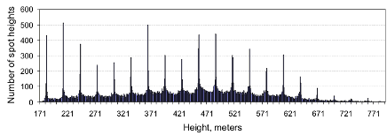
Histogram of the spot heights in the allSpotHeights
data set
This shows the numbers of spot heights with each of the various
possible heights in the data range (from 171 to 792 meters in this
case).
What accounts for this unusual 'spiky' distribution? How do you think
the data for this DEM were derived? Post suggestions to the Project
5 Discussion Forum, and I'll let you know when someone has figured
it out.
Ready to continue? Click on the "Next" link, above, to continue with
this project.
PROJECT 5: INTERPOLATION METHODS
Making A Random Spot Height Dataset
In this case, we have a 500 meter resolution DEM, so that
interpolation would not normally be necessary, assuming that this was
adequate for our purposes. In this section, I will explain how to
create a random set of spot heights derived from the DEM, so that we
can work with those spot heights to evaluate how well different
interpolation methods reconstruct the original data. Note that there is
an alternative approach using the Data Management - Create Random
Points and the Spatial Analyst - Extraction - Extract By Points tools
in the Arc Toolbox. If you have the appropriate licences (Arc/INFO,
then you can experiment with using these instead to generate around 600
spot heights, as described below).
Follow the steps below, using the centralPA.mxd file:
- Right-click on the allSpotHeights layer and select the
Open Attribute Table... option from the pop-up menu. The layer's
attribute table will open.
- Right-click on the heading of the column labeled Selector,
and select the Calculate Values... option.
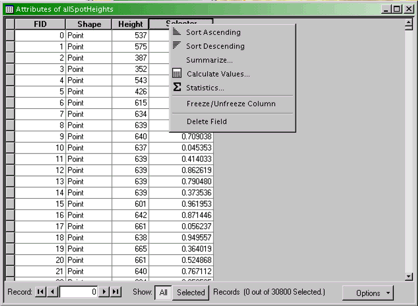
The attribute table for the allSpotHeights layer.
- Ignore the message about doing calculations outside an edit session
and continue to the Field Calculator dialog. Enter a
calculation so the Selector variable is calculated from the
expression rnd(), as shown below.
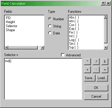
Field Calculator dialog showing the calculation
required in this case (see text).
- Click OK. The Selector values in the attribute
table for allSpotHeights will change.
- Now, perform a selection operation on the allSpotHeights
layer, using Select by Attribute... with Selector > 0.98
. This will select around 600 spot heights at random from the full data
set. You should export these to make a new shape file, which you use in
the remainder of this project to perform interpolation.
A typical random selection of spot heights is shown below.
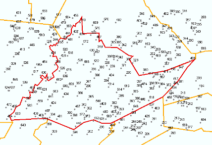
A random set of spot heights for use in subsequent
parts of this project
Ready to continue? Click on the "Next" link, above, to continue with
this project.
PROJECT 5: INTERPOLATION METHODS
Inverse Distance Weighted Interpolation (1)
Preliminaries
Before doing any interpolation, it is important to ensure that the
Spatial Analyst extension is enabled in ArcMap and that you have
sensible settings for the ArcMap Spatial Analyst.
To enable the Spatial Analyst:
- Select the menu item Tools - Extensions... and enable the
Spatial Analyst.
- Right-click on the toolbar and enable the Spatial Analyst toolbar.
To setup the Spatial Analyst options:
- Select the Spatial Analyst - Options... menu item.
- In the General tab, set an appropriate temporary
Working directory, choose the allSpotHeights layer for the
Analysis mask, and choose to save the analysis results in the
same coordinate system as the data frame (the second option).
- In the Extent tab, set the analysis extent to Same as
Layer "allSpotHeights".
- In the Cell Size tab set the Cell size to 500.
Performing inverse distance weighted interpolation
- Once the Spatial Analyst is set up correctly, it is a simple matter
to perform inverse distance weighted interpolation. Select the
Spatial Analyst - Interpolate to Raster - Inverse Distance Weighted...
menu option. The dialog below will appear.
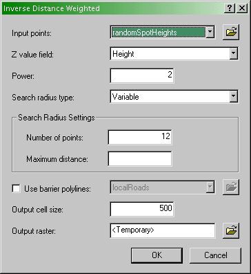
Specify the inverse distance weighted interpolation
parameters here
- Here you specify various options as discussed in the text:
- Input points specifies the layer containing the control
points.
- Z value field specifies which attribute of the control
points you are interpolating.
- Power is the inverse power for the interpolation. 1 is a
simple inverse (1 / d), 2 is an inverse square (1 / d
2). You can set a value close to 0 (but not 0) if you want to see
what simple spatial averaging looks like (as discussed on pages 225-7
of the text).
- Search radius type specifies either Variable
radius defined by the number of points or Fixed radius defined
by a maximum distance.
- Search radius settings. Here you defined Number of
points and Maximum distance as required by the Search
radius type you are using..
- Output cell size. This setting should be defined in the
Spatial Analyst - Options as 500 (see above).
- Output raster. To begin with, it's worth requesting a
<Temporary> output until you get a feel for how things work. Once
you are more comfortable with it, you can specify a file name for
permanent storage of the output as raster dataset.
- Experiment with these settings until you have a map you are happy
with.
Make an interpolated map using the inverse distance
weighted method. Insert the map into your write-up, along with your
commentary on the advantages and disadvantages of this method and a
discussion of why you chose the settings that you did.
Ready to continue? Click on the "Next" link, above, to continue with
this project.
PROJECT 5: INTERPOLATION METHODS
Inverse Distance Weighted Interpolation (2)
Creating a map of interpolation errors
The Spatial Analyst doesn't create a map of errors by default (why?)
but in this case, we have the correct data, so it is instructive to
compile an error map to see where your interpolation output fits well
and where it doesn't.
- Use the Spatial Analyst - Raster Calculator... menu option
to bring up the Raster Calculator dialog:
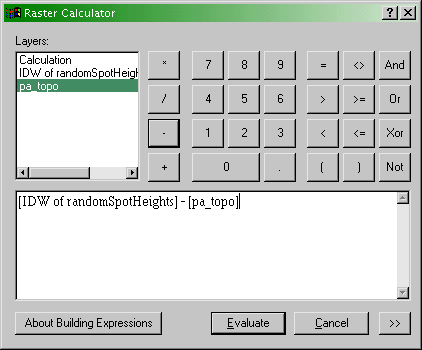
The Spatial Analyst Raster Calculator dialog. Here
you can define operations on raster map layers such as calculating the
error in your interpolation output (see text).
- The error at each location in your interpolated map is (
interpolated elevation - actual elevation). It is a simple
matter to enter this equation in the expression editor section of the
dialog, as shown. When you click Evaluate, you will get a new
raster layer showing the errors, both positive and negative, in your
interpolation output.
- Using the Spatial Analyst - Surface Analysis - Contour...
tool, you can draw error contours and examine how these relate to both
your interpolated and actual elevation maps. Where are the errors
largest? What are the errors at or near control points in the random
spot heights layer? What feature of these data does inverse distance
weighted interpolation not capture well?
Make a layer showing the error at each location in the
interpolated map. You may present this as a contour map over the actual
or interpolated data if you prefer. Insert the map into your write-up,
along with your commentary describing the spatial patterns of error in
this case.
Ready to continue? Click on the "Next" link, above, to continue with
this project.
PROJECT 5: INTERPOLATION METHODS
Kriging Using The Geostatistical Analyst
Preliminaries
Before you can use the Geostatistical Analyst, you have to enable it.
Use the Tools - Extensions... menu and right-click on the
toolbar to ensure that the Geostatistical Analyst is available.
'Simple' kriging
We use the Geostatistical Wizard to run kriging analyses. Access the
wizard from the Geostatistical Analyst - Geostatistical Wizard...
menu item. The wizard consists of a series of screens, which are
explained below.
- The Geostatistical Wizard: Choose Input Data and Method
dialog
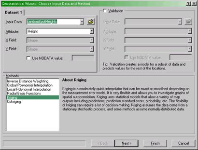
The first screen of the Geostatistical Wizard.
Specify the data set and method to use here.
Here you specify the Input Data (your random spot heights
layer) and Attribute (Height) that you are interpolating. You
also specify the Method to use. Select Kriging from
the list, and then click Next >.
- The Geostatistical Wizard Step 1 of 4 - Geostatistical Method
Selection dialog
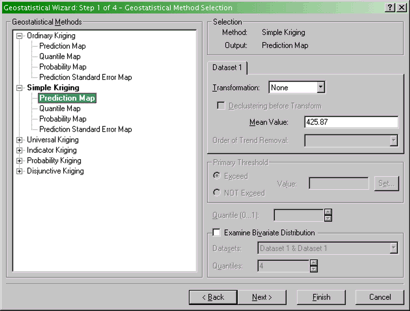
Specifying the exact method of kriging.
In this dialog you select from a number of different kriging
methods and the type of output you are interested in. Select a
Simple Kriging Prediction Map. Click Next >.
- The Geostatistical Wizard Step 2 of 4 - Semivariogram /
Covariance Modeling dialog
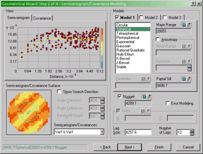
Specifying the semivariogram model to work with in
kriging.
Here you should select the Semivariogram tab, and you can
select a function to fit from the long list available to the right of
the graphical display. You can experiment with these, although I would
recommend sticking with one of the first five or six, since the later
ones are slow to calculate...and it's debatable how much of a
difference it makes!
There is also an option here to specify assuming Anisotropy
in constructing the semivariogram (you may want to refer back to the
readings in the text on this!). This will be important later, when it
comes to the deliverables for this part of the project.
When you are finished experimenting, click on Next >.
- The Geostatistical Wizard Step 3 of 4 - Searching Neighborhood
dialog
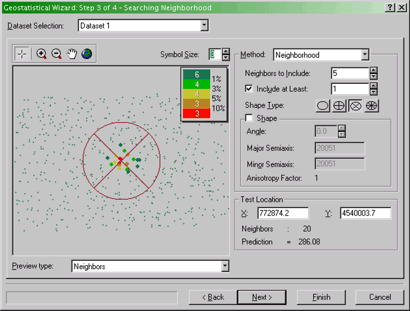
Specifying properties of the search neighborhood for
kriging.
Here you can get previews of what the interpolated surface will
look like given the currently selected parameters. Switch between a
view showing the neighbors included in each local estimate and a
preview of the interpolated surface by selecting Neighbors or
Surface from the Preview type drop-down list.
Also specify how many neighbors to include using the Method:
Neighborhood options. You can specify how many Neighbors to
Include in the local estimates and also how they are distribute
around the location to be estimated using the Shape Type
options. The  button applies a simple limit on the number of neighbors in
all directions. The various 'pie slice' buttons,
button applies a simple limit on the number of neighbors in
all directions. The various 'pie slice' buttons,  , define several regions around the location which are each required to
contain the required number of neighboring control points as specified
by the Neighbors to Include option. You can get a feel for how
these controls affect the calculation using the Neighbors
preview.
, define several regions around the location which are each required to
contain the required number of neighboring control points as specified
by the Neighbors to Include option. You can get a feel for how
these controls affect the calculation using the Neighbors
preview.
After this stage, click Finish. (We won't be going into
the other step in the Wizard, although you can try it, if you like!)
The Geostatistical Analyst makes a new layer and adds it to the map.
You will find it helpful in comparing this layer to the 'correct'
result (i.e., the pa_topo layer) to right-click on it and
adjust its Symbology so that only contours are displayed.
Things to do...
The above steps have walked you through the rather involved process
of creating an interpolated map by kriging. What you should do now is
simply specified, but may take a while experimenting with various
settings.
Make two maps using simple kriging, one with an
isotropic semivariogram, the other with an anisotropic
semivariogram. Insert these into your write-up, along with your
commentary on what you learned from this process. How (if at all) does
an anisotropic semivariogram improve your results?
See what you can achieve with Universal kriging. The options
are similar to Simple kriging but allow use of a trend surface
as a baseline estimate of the data, and this can improve the results
further. Certainly, if kriging is an important method in your work, you
will want to look more closely at the options available here.
Ready to continue? Click on the "Next" link, above, to continue with
this project.
End of Project 5 - Remember, if you have any
questions, post them to the appropriate Discussion Forum.
QUARTER-LONG PROJECT
Week 5: Finishing the Peer Review Process
Last week you were assigned two other students' project proposals to
review. This week you should be finishing up your reviews, which are
due by the end of the week. Timely submission of your reviews is worth
4 of the 30 total points available for the quarter-long project.
Refer back to the
Week 4 directions if you need a reminder of the kinds of comments
you should provide in your reviews.
Use Post your comments on each assigned project proposal to
the 'Project Initial Proposal discussion board' as responses to the
messages announcing your assigned projects. Your peer reviews are due
by the end of this week (midnight end of the day, Tuesday).
Questions?
If you have any questions now or at any point during this project,
please feel free to post them to the Quarter-long Project
Discussion Forum. (That Discussion Forum can be accessed at any
time by clicking on the In Touch tab, above, and then
scrolling down to the Discussion Forums section.)
That's it for the quarter-long project this week!