Lesson 8 Overview
LESSON 8: SPATIAL AUTOCORRELATION
Lesson 8 Overview
Introduction
The most basic observation to be made about spatial data is that it
typically exhibits spatial structure. In statistical terms, this
translates to the observation that spatial data are not random. Knowing
something about a phenomenon at some location A, often tells us a great
deal about the same phenomenon at a location not far away from A.
Another way of putting this is that spatial data sets are
correlated with themselves over distance.
When two variables x and y are correlated,
then given the value of x for a particular case, I can make a
good estimate of the likely value of y for that case.
Similarly, given information about the value of some attribute measured
at spatial location A, then I can often make a reasonable estimate of
the value of the same attribute at a nearby location to A. This is due
to spatial autocorrelation (spatial self-correlation).
Much of the material we have studied so far in this course makes use
of spatial autocorrelation in data, whether it is assumed or measured.
Perhaps the best example is interpolation (see Lesson 5) where we use
information only from nearby control points to inform our calculation
of an estimated value at a location where no observation has been
recorded. We do this because we expect nearby data to be more relevant
than distant data. In kriging, this is taken one step further when one
method of measuring spatial autocorrelation--the semivariogram--is used
to improve further the estimates produced by an interpolation method.
In this week's lesson we look in a more general way at the various
approaches that spatial analysts and geographers have developed for
measuring spatial autocorrelation.
Learning Objectives
By the end of this lesson, you should be able to
- define autocorrelation with reference to Tobler's 'first law' of
geography and distinguish between first and second order effects in a
spatial distribution
- differentiate between isotropic and anisotropic spatial
distributions
- justify, compute and test the significance of the joins count
statistic for a pattern of area objects
- compute Moran's I and Geary's c for a pattern of
attribute data measured on interval or ratio scales
- explain the importance of spatial weights matrices to the
development of autocorrelation measures and variations of the approach,
particularly lagged autocorrelation
- explain how autocorrelation measures can be generalized to compute
and map Local Indices of Spatial Association (LISA)
- describe how Monte Carlo methods may be used to determine
significance for LISA
Reading Assignment
The reading this week is all in Chapter 7. You need to read the
following selections from the textbook:
- Section 7.4, "Spatial Autocorrelation: Introducing the Joins Count
Approach," pages 180-92
- Section 7.5, "Fully Worked Example: The 2000 US Presidential
Election," pages 192-6
- Section 7.6, "Other Measures of Spatial Autocorrelation," pages
196-203
- Section 7.7, "Local Indicators of Spatial Association," pages 203-5
After you've completed the reading, get back online and supplement
your reading from the commentary material, then test your knowledge
with the self-test quizz.
Lesson 8 Deliverables
This lesson is one week in length. The following items must be
completed by the end of the week. See the Calendar tab, above,
for the specific date.
- Complete the self-test quiz satisfactorily (you have an unlimited
number of attempts and must score 90% or more).
- Complete Project 8. This week's project explores
ethnic residential segregation in Auckland, New Zealand using spatial
autocorellation measures provided by the GeoDa tool. (The
materials for Project 8 can be found under the Lessons tab, in the
Lesson 8 folder.)
- Continue the Quarter-long Project by posting
evidence of your progress this week. See the
Week 8 directions for details. (This link opens in a new window.)
Questions?
If you have any questions now or at any point during this lesson,
please feel free to post them to the Lesson 8 thread on the
Lesson Content Discussion Forum.(That Discussion Forum can be
accessed at any time by clicking on the Communicate tab,
above, and then scrolling down to the Discussion Forums
section.)
Ready to continue? Click on the "Next" link, above, to continue with
this lesson.
LESSON 8: SPATIAL AUTOCORRELATION
Commentary - Chapter 7, Section 7.4, "Spatial Autocorrelation:
Introducing the Joins Count Approach"
In this section the simplest method of measuring
autocorrelation is described: the joins count statistic. In
practice, joins counting is not used much, but understanding the basis
for this approach will enable you to understand the similar ideas
underlying other methods.
A good place to start is actually halfway through the text; look at
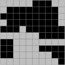
figure 7.5 on page 187. This is probably the most readily understood
description of the meaning of positive, negative, and no
autocorrelation. In a positively autocorrelated map, like cases are
grouped together, so that, on average, map units are of the same type
as their neighbors. In a negatively autocorrelated map, map units of
different types are mixed among one another, the most extreme case
being the checkerboard illustrated in figure 7.5 part (c). In
this case, knowing what type one map unit is tells us immediately that
any of its neighbors is of the opposite type. Students often have
difficulty understanding that an uncorrelated map is simply a
random one, not a negatively correlated one.
Just to emphasize the point,
patterns that are not as clear cut as those in figure 7.5 can be
positively autocorrelated because each square tends to have similar
neighbors, even if the overall arrangement is 'random'.
A more realistic example of positive autocorrelation:
units are likely to be the same as their neighbors, but the overall
pattern is a randomly shaped configuration.
Similarly, negative autocorrelation is a tendency for map units to
differ from their neighbors. It does not occur only in a perfect
checkerboard:
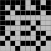
A negatively autocorrelated map. Parts of this map
are 'checkerboard-like' but some parts are not.
Finally, an uncorrelated, or random map, is simply that: random.
Both cases below are random maps. Altough each has regions which we
might designate as positively (or negatively) autocorrelated, there is
no overall tendency for like or unlike cells to be neighbors.
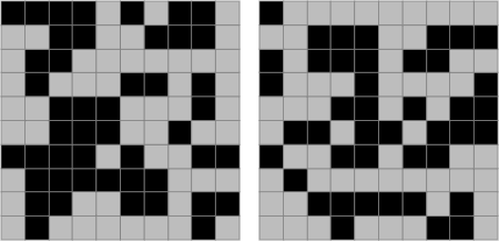
Two random patterns. The one on the left tends toward
positive autocorrelation, while the one on the right tends to negative
autocorrelation. Both were generated completely at random.
It is exactly this 'fuzziness' in the nature of autocorrelation that
calls for precisely defined ways of measuring the phenomenon.
Runs in Serial Data or One-Dimensional Autocorrelation
Before we go on to two-dimensional (i.e., spatial) data it is
conceptually easier to develop a method for assessing autocorrelation
in serial data. A series of coin flips or draws from a deck of cards is
the example used in the text. More 'real world' examples might be
records of whether or not the maximum temperature one day was higher
than that the day before. A similar idea would be whether a market
index was up or down each day (or week or month). A less serious, but
just as familiar, example is the case of sports teams in a 'streak' of
success (or failure). In the United States the most familar example is
'streaky' shooting from the free throw line in basketball. Using the
runs count statistic, it is possible to test whether or not there are
statistical grounds for considering any of these examples of streaks as
unusual or not.
The runs count idea is very simple. Each unbroken sequence of a
particular outcome is considered as a 'run' of that outcome. This
reduces a sequence such as
HHTTTHTHHTTHTHHHH
to
HH 1
TTT 2
H 3
T 4
HH 5
TT 6
H 7
T 8
HHHH 9
where the subscripts count the runs of (
underlined) like outcomes. In this case, there are nine runs. As
explained on pages 183-6 this result can be assessed statistically to
determine if it is unusual relative to what we would expect from a
random sequence of outcomes.
In this case, using equation (7.22) on page 185, we can say that we
would expect 8 runs with a standard deviation of 2. This allows us to
say that the observed number of runs, at 9, is really not very unusual,
since it has an associated z score of (9 - 8) / 2 = 0.5, which
is well within the bounds of what we would expect to see by chance
variation. It's worth noting that this is the case even though there is
one run of three tails, and one of four heads in this sequence (which
some people might find surprising).
The trickiest concept here is the distinction between non-free and
free sampling. As noted in the text, in geographic examples we are
usually dealing with a situation where it would be unreasonable to
assume an analogy to flipping a coin when examining the state of a set
of geographic units. Rather, it is more correct to consider them
analogous to drawing from a deck of cards with known numbers of units
of each type.
Extending Runs Counting to Two Dimensions: The Joins Count
Of course, we aren't really interested in flipping coins or drawing
cards from a deck, but rather in developing a way of measuring how
strongly a map is patterned. As discussed in the text, a close cousin
of the runs count idea applied to map patterns is joins counting.
Instead of counting the number of sequences of like cases, we count the
different types of neighboring pairs of interest. In a two-type
situation (blacks and whites) there are three types of neighboring
pairs or joins: black-black, white-white, and black-white (in
either order).
In a positively autocorrelated case, where like is near like, there
will be large numbers of black-black and white-white joins and
relatively few black-white joins. In a negatively autocorrelated case,
with different type map units frequently neighbors, black-white joins
will predominate.
Whether any particular map pattern is unusual with respect to the
expected numbers of joins of the different types can thus be reduced to
a statistical calculation, where we first count the joins of various
types, then calculate the expected numbers of joins of each type, then
convert the observed numbers to z scores so that we can assess
how unusual they are and whether they are high or low.
The hardest thing here is to get to grips with the k and
m factors that are used in the various complex equations on pages
188-90. k is straightforward, being simply the total number of
joins on the map. m is less obvious. Its calculation is shown
as an equation (7.26). For each map unit, we count its neighbors and
multiply this number by the same number minus one. We then sum all
these results up and multiply by one-half to arrive at the value for
m used in calculation of the standard deviations in equation
(7.25).
All should become clear in the worked example in the following
section.
Ready to continue? Click on the "Next" link, above, to continue with
this lesson.
LESSON 8: SPATIAL AUTOCORRELATION
Commentary - Chapter 7, Section 7.5, "Fully Worked Example: The 2000
U.S. Presidential Election"
The central aspect of the calculation is shown in figure 7.7 on page
194. This
adjacency
matrix (remember back in Lesson 1?) records for each state
which states are its neighbors. From this matrix the k and
m parameters can be calculated. Since k is simply the
total number of joins in the map, it is given by the total number of
'1's in the matrix divided by two (since each join appears twice in the
matrix). Calculation of m is done by totaling the number of
'1's in each row of the matrix (e.g. for Tennessee, in row 24, there
are 8) multiplying by one less than this number (in this case 8 � 7 =
56), then summing all these products for all rows in the matrix and
dividing by two. The result is 440. You can see that these calculations
are much better handled by a computer than by an error-prone human
being.
Once k and m have been determined, the next step is
to calculate expected numbers of joins of each type based on some
probability model for the occurrence of states of each type. The
simplest approach is to use a free-sampling model (perhaps not the best
method, certainly the easiest). Using the noted numbers of votes for
each candidate we arrive at the stated expected joins counts of each
type recorded equation (7.35) on page 195.
These are substantially different from the observed joins counts
stated in equation (7.36) on page 195.
There are many more BB joins, somewhat fewer WW joins, and many fewer
BW joins than expected.
All of these results are consistent with positive
autocorrelation in the map, since more BB joins (a like
with like neighboring pair) and fewer BW joins (a like with
unlike neighboring pair) both support the idea that similar outcomes
are likely in neighboring map units.
This basic observation is confirmed statistically when we convert the
observed joins counts to z scores using the
standard deviations from equation (7.35), as shown in table 7.4.
It is worth noting here that interpretation of joins count results
can be a little confusing, since not all the results will be consistent
with the type of autocorrelation. In this example, the number of WW
joins is about what would be expected (a little low, but not far from
expectations). Nevertheless, the unexpectedly high number of BB joins,
and unexpectedly low number of BW joins are both indicative of positive
autocorrelation so we conclude that the map is positively
autocorrelated.
Ready to continue? Click on the "Next" link, above, to continue with
this lesson.
LESSON 8: SPATIAL AUTOCORRELATION
Commentary - Chapter 7, Section 7.6, "Other Measures of Spatial
Autocorrelation"
Problems with joins counting are evident. In particular, it does not
work for numeric data. Other measures have been developed for numerical
data, and, in practice, these are much more widely used.
While the equations for both Moran's I (pages 197-201) and
Geary's c (page 201) look intimidating, they make a great deal of
sense. Both consist of
- a measure of similarity,
- a mechanism that includes only those map units that are near to one
another in the calculation, and
- a weighting factor that scales the resulting calculation so that it
is in a standard numerical range.
In the case of Moran's I, the similarity measure is the
standard method uses in correlation statistics, namely the product of
the differences in each value from the mean. This produces a positive
result when both the value and neighboring values are higher or lower
than the mean and a negative result when the value and neighboring
values are on opposite sides of the mean (one higher, the other lower).
For Geary's c the similarity measure is the squared
difference in the two values.
In each case, the difference measure is summed over all neighboring
pairs of map units (this is where the wij values
from a weights matrix come in) and then adjusted so that the resulting
index value is in a standard numerical range.
Using other Weight Matrices, pages 201-3
The inclusion of spatial
interaction weights between pairs of map units in the formulas for
calculating I and c means that it is possible to
experiment with a wide variety of
autocorrelation measures by tailoring the particular choice of
interaction weights appropriately.
You will be able to explore these possibilities in this week's
project using the GeoDa software.
Ready to continue? Click on the "Next" link, above, to continue with
this lesson.
LESSON 8: SPATIAL AUTOCORRELATION
Commentary - Chapter 7, Section 7.7, "Local Indicators of Spatial
Association"
The final topic in measuring spatial
autocorrelation is LISA or Local Indicators of Spatial
Association.
All the previously discussed measures of spatial autocorrelation
share the common weakness that they do not identify specific locations
on a map where the measured autocorrelation is most pronounced. That
is, they are global measures, which tell us that the map data
are autocorrelated but not where to find the data that contribute most
to that conclusion. Equally, global measures do not allow us to
identify map regions where the pattern runs counter to the overall
autocorrelation trend.
LISA statistics address these failings and exemplify a trend in
spatial analysis in favor of approaches that emphasize local effects
over global ones. (See the papers by Unwin 1996 and Fotheringham 1997
cited in the text for more details on this trend.)
The LISA approach simply involves recording the contributions from
individual map units to the overall summary measure whether it is
Moran's I or Geary's c.
Significance tests on LISA statistics are hard to calculate and
generally depend on
Monte Carlo simulation, as was previously discussed in the context
of
point pattern analysis (see Lesson 4). The idea is that a computer
can randomly rearrange the map unit values many times, measuring the
LISA statistic for each map unit each time, and then determine if
actual observed LISA values are unusual with respect to this simulated
distribution of values.

Ready? Take the Chapter 7 Quiz to check your knowledge! Click on the
"Next" link, above, to access the self-test quiz on Spatial
Autocorrelation. You have an unlimited number of attempts and must
score 90% or more.
Ready to continue? Click on the "Next" link, above, to begin the
Chapter 7 Quiz.
LESSON 8: SPATIAL AUTOCORRELATION
Final Activities for Lesson 8
Now that you've completed the readings and the self-test quiz for
this lesson, it is time to apply what you've learned!
 The following links will open in a new browser window.
- Complete Project 8. This week's project explores
ethnic residential segregation in Auckland, New Zealand using spatial
autocorellation measures provided by the GeoDa tool. (The materials for
Project 8 can be found under the Lessons tab, in the
Lesson 8 folder.) Email your completed writeup to me.
- Continue the Quarter-long Project by posting
evidence of your progress this week. See the
Week 8 directions for details.
Ready to continue? Click on the "Next" link, above, to begin Project
8.
PROJECT 8: SPATIAL AUTOCORRELATION ANALYSIS USING
GEODA
Overview
Background
This week's project uses not a GIS program, but a package for
exploratory spatial data analysis, called GeoDa.
GeoDa is a good example of current research software, which
implements many methods that have been in the academic research
literature for several years, but which have yet to make it into
standard desktop GIS tools. Among the methods it offers are simple
measures of spatial autocorrelation.
You will use GeoDa to examine the spatial distribution of
different ethnic groups in Auckland, New Zealand (where I live).
Until the last 20 years or so, Auckland was a relatively 'sleepy'
industrial port. It has been New Zealand's largest city for about a
century, but its dominance of the national economy has become even more
marked in recent years. This is partly attributable to increasing
numbers of immigrants to New Zealand, almost all of whom have settled
in the Auckland region. Today, Auckland accounts for about one third of
the total population of the country (about 1.35 million people
depending on where you think the city stops), and for a much larger
fraction of the more recent migrant groups. Auckland is the largest
Pacific Islander city in the world, and also home to large populations
of M�ori (the pre-European indigenous people), and Asian peoples,
alongside the majority European-descended (or, in M�ori, 'Pakeha')
'white' population.
Such rapid change is exciting (it has certainly improved the food in
Auckland!), but can also lead to strains and tensions between and
within communities. We can't possibly explore all that is going on in a
short project like this, but hopefully you will get some flavor of the
city from this exercise.
The basic analytical approach adopted in this project is very similar
to that presented by Andrea Frank in an article:
'Using measures of spatial autocorrelation to describe socio-economic
and racial residential patterns in US urban areas' pages 147-62 in
Socio-Economic Applications of Geographic Information Science
edited by David Kidner, Gary Higgs and Sean White (Taylor and Francis,
London), 2002.
This week's project is deliberately more like a short exercise than
some of the earlier projects. This is for two reasons. First, you
should be spending an increasing amount of time on your quarter-long
project. Second, we will cover some ideas in this project not covered
in class, and also introduce a new tool. If you want to explore these
ideas and the GeoDa tool further then I hope that this
exercise will give you an idea where to start!
Project Resources
The zip file you need for Project 8,
project8materials.zip, is available here for download. (That
file is 3.4 Mb and will take approximately 8 minutes to download over a
56 Kbps modem.) If you have any difficulty downloading this file,
please contact me.
The contents of this archive are as follows:
- ak_CAU01_ethnic shapefiles showing the greater Auckland
region delineated by the New Zealand 2001 Census Area Units (CAUs).
CAUs are roughly equivalent to tracts in the US census, with a few
thousand people in each CAU. There are 355 of these in the greater
Auckland region. The data table for this shapefile contains counts and
percentages of the population in each of five groups (European, M�ori,
Pacific Islander, Asian, and 'Other').
- akCity_CAU01_ethnic shapefiles showing the 101 CAUs of the
central Auckland 'City' region. This area contains the CBD and many of
the more upscale neighborhoods of the city. The ethnicity count and
percentage data are repeated in these files.
- akCity_MB01_ethnic shapefiles showing 2001 Census 'Mesh
Blocks' for the City area. Mesh Blocks (MBs) are the smallest areal
unit used in the New Zealand census with no more than a few hundred
people in each. There are almost 3000 MBs in the City area alone.
- ak_DEM_100 raster digital elevation model files that will
give you some idea of the topography of the city although this is for
interest only and has no effect on the details of the project.
- nz_coastline shapefiles are also for interest only and will
give you some context for Auckland's location relative to the country
as a whole (it's 'near the top'!).
- Three GAL files showing contiguity for the census shapefiles. These
are used by
GeoDa to perform autocorrelation analysis and will be explained in more
detail in the project instructions.
You will also need a copy of the GeoDa software in order to
run the required analysis for this project. GeoDa is available
for download from the Spatial Analysis Laboratory (SAL) at the
University of Illinois at Urbana-Champaign here: https://www.geoda.uiuc.edu/downloadin.php. If you
have trouble with that link, try this one:
https://netfiles.uiuc.edu/koschins/shared/GeoDa.exe or this one
https://www.geoda.uiuc.edu/downloads/geoda_downloads#new.
Instructions for installing
GeoDa are also available from the SAL website. Version 0.9.5-i of
GeoDa was current at the time of writing and was used to prepare these
project instructions, so where possible, this is the version you should
use.
Summary of Project 8 Deliverables
For Project 8, the items you are required to have in your write-up
are:
 For a single variable on a single map, describe the results
of a global Moran's spatial autocorrelation analysis. Include a
choropleth map and Moran's scatter plot along with commentary and your
interpretation of the results. In particular, identify map areas that
contribute strongly to the global outcome.
For a single variable on a single map, describe the results
of a global Moran's spatial autocorrelation analysis. Include a
choropleth map and Moran's scatter plot along with commentary and your
interpretation of the results. In particular, identify map areas that
contribute strongly to the global outcome.- For a single variable on a single map (but a different
variable and a different map from the last one), describe results of a
univariate LISA analysis. Include the Cluster map and Moran's scatter
plot in your write-up along with commentary and your interpretation of
the results.
Questions?
If you have any questions now or at any point during this project,
please feel free to post them to the Project 8 thread on the
Project Discussion Forum. (That Discussion Forum can be accessed at
any time by clicking on the In Touch tab, above, and then
scrolling down to the Discussion Forums section.)
Ready to continue? Click on the "Next" link, above, to continue with
this project.
PROJECT 8: SPATIAL AUTOCORRELATION ANALYSIS USING GEODA
GeoDa Basics
Once installed, you run GeoDa by clicking an icon or
double-clicking a shortcut in the usual way. If the GeoDa
installer did not make an entry in the Start Menu, you can create a
shortcut by navigating to c:\Program Files\GeoDa\geoda095i.exe
then right-clicking and selecting Create Shortcut.
When GeoDa starts up, open a shapefile from the File -
Open Project menu selection and navigate to the shapefile you want
to look at. The Key Variable setting in the GeoDa Project
Setting dialog (below) is not important and can be left as the
default selection.
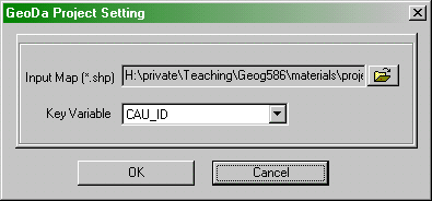
The GeoDa Project Setting dialog.
Making maps in GeoDa is simple: select the type of map you
want from the Map menu. With the datasets you are working with
in this project, only the first four options, Quantile,
Percentile, Box Map and St Dev. make sense. Each
of these makes a choropleth with the class intervals based on a
different statistical view of the data (recall the project in Lesson
Two).
In the current version of GeoDa (Version 0.9.5-i), I have
been unable to get the Cartogram to work with the Census Area Unit
shapefiles used in this project. I believe that this is a problem with
the shapefiles, and not with GeoDa. Specifically, when ArcGIS
is used to aggregate polygon shapefiles from smaller units (here, I
made the CAUs from the mesh block data) it often shifts polygon
boundaries sufficiently that they no longer touch one another. The
cartogram tool relies on polygons touching one another for its
simplified picture of the map. If you are interested in making a
cartogram the akCity_MB01_ethnic shapefile works, or try the
sample data sets supplied with GeoDa.
The main focus of GeoDa is exploratory spatial data
analysis (ESDA). To get a flavor of this, try making a histogram
or scatterplot using the named options in the Explore menu.
Once you have a histogram or scatterplot in one window, you can select
data points in the statistical display, and see those selections
highlighted in the map views. In general, any selection in any window
in GeoDa will be highlighted in all map views. This is called
linked-brushing and is a key feature of exploratory data analysis.
Linked brushing can help you to see patterns in spatial data more
readily, particularly spatial autocorrelation effects. When data is
positively spatially autocorrelated moving the 'brush' in an area in a
statistical display (say a scatterplot) will typically show you sets of
locations in the map views that are also close together. Moving the
brush around can help you to spot cases that do not follow the trend.
For a moving brush, make a selection in any view while holding down
the <CTRL> key. Once you have made the selection, you can let
go of the <CTRL> key and then move the selection area around
by dragging with the mouse. To stop the moving selection, click again,
anywhere in the current view.
Of course, as you are well aware, seeing a pattern is not the same as
it really being there. In the case of autocorrelation, that is the role
of the measures we have covered in this lesson's reading, and in
particular, Moran's I, which we will look at more closely in
the remainder of this project.
Ready to continue? Click on the "Next" link, above, to continue with
this project.
PROJECT 8: SPATIAL AUTOCORRELATION ANALYSIS USING GEODA
Global Autocorrelation
While GeoDa is like a GIS, you will soon find its
cartographic capabilities somewhat limited. Where it really comes into
its own is in the integration of spatial analysis methods with mapping
tools.
Contiguity matrices
To determine the spatial autocorrelation of a variable globally
across a map using Moran's I, you access the Spatial -
Univariate Moran menu. However, before doing this, you need a
representation of the contiguity structure of the map, that is, which
map units are neighbors to each other. This provides the wij
values for the Moran's I calculation to determine which
pairs of attribute values should be included in the correlation
calculation.
GeoDa provides tools for creating contiguity matrices under
the Tools - Weights > Create menu option. Selecting this
option opens the CREATING WEIGHTS dialog:
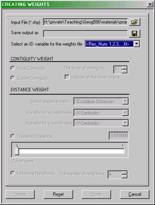
The GeoDa CREATING WEIGHTS dialog box
The various options available here are explained in the GeoDa
documentation. For the purposes of this project I have already created
simple contiguity matrix files called ak_CAU01.gal,
akCity_CAU01.gal and akCity_MB01.gal. It is instructive to
examine (but don't edit!) these files in a text editor. For example, if
you open akCity_CAU, the first few lines look like this:
101
1 6
3 5 21 23 25 28
2 4
3 4 21 34
3 5
1 2 4 5 21
4 5
2 3 5 6 34
5 7
1 3 4 6 25 28 29
The first line here shows how many areal units there are in the
associated shapefile, in this case the 101 CAUs in Auckland City. Each
pair of lines after that has the following format.
- First is an ID number for an areal unit followed by the number of
neighbors it has. In this case, the CAU with ID number (in fact, just a
sequence number) 1, has 6 neighbors.
- In the next line the sequence numbers of these are identified as 3,
5, 21, 23, 25 and 28.
A more complete explanation of alternative formats for GAL and GWT
formats (the latter allows weighted contiguities based on inverse
distance and so on) is provided in the GeoDa documentation.
The real reason I have provided pre-calculated GAL files is that the
previously mentioned problem with the CAU shapefiles (see the previous
page) prevents GeoDa from successfully calculating them
itself. I was able to get around the problem using the
R statistical software with the spdep,
shapefile and maptools packages. If you ever face a
similar problem you may also find this helpful. spdep provides
a method for calculating GAL files that includes a tolerance, so that
areal units within a specified 'snap' distance of one another are
considered neighbors.
Calculating Global Moran's I and the Moran Scatterplot
This is easy. Select the Space - Univariate Moran menu
option and specify the variable to use, and the contiguity matrix to
use. GeoDa will think for a while, and then present you with a
display that shows the calculated value of Moran's I and a
scatterplot.
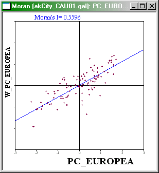
Moran Scatterplot showing relationship between a
variable and the average value of its neighbors for the same variable.
The Moran Scatterplot is an illustration of the relationship between
the values of the chosen attribute at each location and the average
value of the same attribute at neighboring locations. In the case
shown, large Percentages of Europeans (points on the right hand side of
the plot) tend to be associated with high local average values of
Percentage of Europeans (points toward the top of the plot).
It is instructive to consider each quadrant of the plot. In the
upper-right quadrant are cases where both the value and local average
value of the attribute are higher than the overall average value.
Similarly in the lower-left quadrant are cases where both the value and
local average value of the attribute are lower than the overall average
value. These cases confirm positive autocorrelation. Cases in the other
two quadrants indicate negative autocorrelation. depending on which
groups are dominant, there will be an overall tendency towards positive
or negative (or perhaps no) autocorrelation.
Using linked brushing, you should be able to identify which areas of
the map are most responsible for high or low observed autocorrelation,
and which, if any, locations run counter to the overall pattern.
For a single variable on a single map, describe the results of a
global Moran's spatial autocorrelation analysis in your write-up.
Include a choropleth map and Moran's scatter plot in your write-up
along with commentary and your interpretation of the results. In
particular, identify map areas that contribute strongly to the global
outcome.
Ready to continue? Click on the "Next" link, above, to continue with
this project.
PROJECT 8: SPATIAL AUTOCORRELATION ANALYSIS USING GEODA
Local Indicators of Spatial Association
We saw in the context of point pattern analysis that deriving a
global, whole-map measure is often not the thing of most interest to
analysts. Rather, it may be more important to know which local features
in the data are contributing most strongly to the overall pattern. In
the context of point pattern analysis, this is a relatively simple
notion: if the pattern is clustered, then finding the clusters is the
key. If the data is evenly-spaced, then by definition, this is a global
feature.
In the context of spatial autocorrelation, the localized phenomena of
interest are those areas on the map that contribute particularly
strongly to the overall trend (which is usually positive
autocorrelation). Methods that enable an analyst to identify localized
map regions where data values are strongly positively or negatively
associated with one another are collectively known as Local Indicators
of Spatial Association (or LISA).
Again, GeoDa has a built in capability to calculate LISA
statistics, and provide useful interactive displays of the results.
How LISA works
The menu option in GeoDa is Space - Univariate LISA
. The easiest way to learn how LISA works is to run it:
- Select the Space - Univariate LISA menu option. In the
dialog boxes that appear, specify the variable to use, and the spatial
weights file (i.e., the GAL file).
- Request the Moran Scatterplot, the Significance Map, and the Cluster
Map.
- GeoDa will think for a moment and then produce three new displays.
You can sort them out by selecting the Window - Tile Horizontal
menu option. You should end up with something like this:
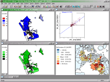
The GeoDa window after running LISA. Note that the
map view here (bottom right) was present before LISA was run.
The meaning of each of these displays is considered in the next
sections.
Moran's Scatterplot
This display is exactly the same one as produced previously using
simple Moran's I. By linking and brushing between this and
other displays you may be able to develop an understanding of what they
are showing you.
LISA Cluster Map
The LISA cluster map looks like this:
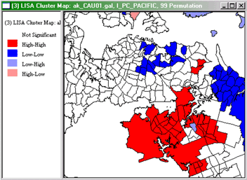
GeoDa LISA Cluster map for Percent Pacific Islanders
in Auckland Region CAUs, 2001.
Interpretation of this map is straightforward. Red highlighted
regions have high values of the variable and have neighbors with high
values also (high-high). As indicated in the legend, blue area are
low-low in the same scheme, while pale blue regions are low-high and
pink areas are high-low. The strongly colored regions are therefore
those that contribute significantly to a positive global
spatial autocorrelation outcome, while paler colors contribute
significantly to a negative autocorrelation outcome.
By right-clicking in this view, you can affect which cases are
displayed, opting to see only those that are most significant. The
relevant menu option is the Significance Filter. The meaning
of this will become clearer when we consider the LISA Significance Map.
LISA Significance Map
The LISA Significance Map is shown below:
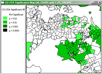
GeoDa LISA Significance Map for Percent Pacific
Islanders in Auckland Region CAUs, 2001.
This display shows the statistical significance level at which each
region can be regarded as making a meaningful contribution to the
global autocorrelation outcome.
This is determined using a rather complex Monte Carlo randomization
procedure (recall Monte Carlo methods from Lesson 4, where they were
discussed in relation to GAM):
- The LISA value for each location is determined from its individual
contribution to the global Moran's I calculation, as discussed on pages
203-5 of the course text.
- Whether or not this value is statistically significant is assessed
by comparing the actual value to the value calculated for the same
location by randomly reassigning the data among all the areal units and
recalculating the values each time.
- Actual LISA values are ranked relative to the set of values produced
by this randomization process.
- If an actual LISA score is among the top 0.1% (or 1% or 5%) of
scores associated with that location under randomization, then it is
judged statistically significant at the 0.001 (or 0.01 or 0.05) level.
Note that a statistically significant result may be either very high or
very low.
The combination of the Cluster Map and the Significance Map allows
you to see which locations are contributing most strongly to the global
outcome and in which direction.
By adjusting the Significance Filter in the Cluster Map you
can see only those areas of highest significance. By selecting the
Randomization right-click menu option and choosing a larger number
of permutations (the default is 99), you can test just how strongly
significant are the high-high and low-low outcomes seen in the Cluster
Map.
I know that this is all rather complicated. Feel free to post questions
to this week's Discussion Forums if you are not following things. Your
colleagues may have a better idea of what is going on than you do!
Failing that, as usual, I will respond to messages posted to the boards
to help clear up any confusions.
For a single variable on a single map (but a different
variable and a different map from the last one), describe the results
of a univariate LISA analysis. Include the Cluster map and Moran's
scatter plot in your write-up along with commentary and your
interpretation of the results.
Ready to continue? Click on the "Next" link, above, to continue with
this project.
PROJECT 8: SPATIAL AUTOCORRELATION ANALYSIS USING
GEODA
Checklist of Project 8 Deliverables
Here is a summary of the deliverables for Project 8, to be posted as
a PDF (preferably) or MS Word document. Once posted, please provide a
link to the document in the discussion forum "Posted project links"
thread for this week. Note that if you don't have access to any
webspace for posting, that you can simply attach the document to your
post to the discussion forum. Make sure you have completed each item!
- For a single variable on a single map, insert into your
write-up results of a global Moran's spatial autocorrelation analysis.
Include a choropleth map and Moran's scatter plot in your write-up
along with commentary and your interpretation of the results. In
particular, identify map areas that contribute strongly to the global
outcome.
- For a single variable on a single map (but a different
variable and a different map from the last one), insert into your
write-up results of a univariate LISA analysis. Include the Cluster map
and Moran's scatter plot in your write-up along with commentary and
your interpretation of the results.
That's it for Project 8!
End of Project 8 - Remember, if you have any
questions, post them to the appropriate Discussion Forum.
QUARTER-LONG PROJECT
Week 8: Posting Evidence of Your Progress (Part 2)
No, really... don't leave it until the last minute! To show
me that you are continuing to make progress on your quarter-long
project, I want you to post another piece of evidence to your web site.
Again, timely submission of such evidence is worth 1 of the 30 total
points available for the quarter-long project.
There is no specific output required as this will vary from project
to project. The aim of this week activity is that you continue to feel
some pressure to work on the project and not leave it all until the
last minute.
Post something that is evidence of your progress (a
screenshot is probably easiest) to your web site, as part of the
"Quarter-long Project" section of your site. Use the course email
system to notify the instructor that you have done this including a
URL.
Questions?
If you have any questions now or at any point during this project,
please feel free to post them to the Quarter-long Project
Discussion Forum. (That Discussion Forum can be accessed at any
time by clicking on the In Touch tab, above, and then
scrolling down to the Discussion Forums section.)
That's it for the quarter-long project this week!