Decoding Meteograms from the University of Wyoming
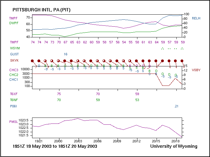 |
| A sample meteogram from the Web site at the University of Wyoming for Pittsburgh International Airport on May 19-20, 2003. |
Getting Your Bearings
- The times and dates covered by the meteogram appear at the bottom of the image. This meteogram from Pittsburgh, Pennsylvania, spans from 1951Z on May 19, 2003 to 1851Z on May 20, 2003.
- Notice the "tic" marks (short, vertical line segments) along the bottom of the first rectangular plot. Each "tic" mark represents a "synoptic time". By convention, "synoptic times" are 00Z, 03Z, 06Z, 09Z, 12Z, 15Z, 18Z, and 21Z. So, on this particular meteogram from Pittsburgh, the first "tic mark" represents 21Z on May 19, the first synoptic time after 1951Z on May 19. The second from the left "tic mark" corresponds to 00Z on May 20; the third from the left corresponds to 03Z; and so on and so forth.
Just in case you have trouble, note that the times and dates are explicitly listed below the "tic marks" along the base of the third rectangular plot at the bottom of the meteogram.
Decoding The Meteogram
Now that you have your general bearings, let's move onto decoding the meteogram:
- There are three time traces on the upper rectangular graph. The purplish plot represents the variation of surface air temperatures with time. Note, below the first rectangular graph, the series of purplish numbers, which represent the hourly surface air temperatures. I really like this feature and find it quite useful.
The greenish plot shows the time variation of surface dew points. The bluish plot marks the variation of surface relative humidity with time.
- Below the hourly temperatures, the green symbols represent precipitation and other restrictions to visibility. These symbols are the same ones that appear on conventional station models. Note the moderate rain observed at the Pittsburgh airport at 15Z on May 20. As an aside, note that the surface relative humidity climbed to nearly 100% once it started to rain at Pittsburgh.
- Below weather and restrictions to visibility, the brownish station models allow you to assess cloud cover, surface wind direction and surface wind speed.
- When winds are gusty, the maximum wind gust is reported directly above the station model. For example, at 01Z on May 20, the maximum wind gust at Pittsburgh International Airport was 16 knots.
- The second rectangular graph includes a plot of horizontal visibility with time (the brown plot). In this case, the visibility at Pittsburgh was 10 miles (read off the scale on the right) from 1951Z on May 19 to 15Z on May 20. Once it started to rain, visibility decreased rapidly, bottoming out at 2 miles between 16 and 17Z on May 20.
The scale on the left represents the heights of cloud bases in feet. At 19Z on May 19, it was overcast over Pittsburgh (note the "O") above 10,000 feet, suggesting an overcast of cirrus (high clouds).
An hour later at 20Z, clouds were "lightly scattered" at 10,000 feet, suggesting some altostratus or altocumulus (middle clouds). "Lightly scattered" may be interpreted similarly to "few". Above 10,000 feet, clouds were broken (probably a broken deck of cirrus).
Okay, look at 13Z on May 20. At this time, clouds were scattered between 3000 and 10000 feet. Clouds were broken at 10,000 feet and overcast above 10,000 feet.
Finally, at 16Z on May 20 (rain had started at Pittsburgh), clouds were lightly scattered between 1000 and 3000 feet (low clouds). Clouds were overcast at 3,000 feet (nimbostratus, for sure).
- Below the second rectangular plot at 00Z, 06Z and 12Z, you'll find the highest temperature during the previous six-hour period (in the purplish color). The greenish temperatures at these synoptic times represent the lowest temperature during the previous six-hour period.
- The next entry corresponds to the amount of liquid precipitation observed in the six-hour period ending at 00Z, 06Z, 12Z, or 18Z. In this case, 0.21 inches of rain fell at Pittsburgh in the six-hour period ending at 18Z on May 20.
- Finally, the third rectangular plot shows the time variation in barometric pressure.